Content architecture and design direction
Commercial-first hierarchy, optional storage, the next-step flow and the balance between prominent numbers and inspectable explanations.
Client website · Commercial solar · AI-assisted design
A commercial-solar website shaped through visual exploration, 3D storytelling and a documented human–AI feedback loop.
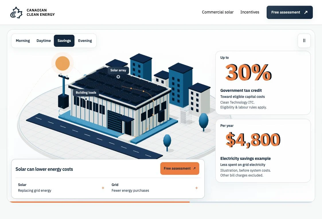
Project status
Client website · Live at canadian-cleanenergy.ca since 16 October 2026
The model is conceptual. Financial figures are qualified or illustrative; this case does not claim customer savings or a measured conversion increase.
Project boundary. Design and AI-assisted implementation for the website and brand system. Enquiry delivery, provider configuration and sales outcomes are not certified by this case study.
My contribution
Design direction, content architecture, identity refinement, responsive interface design and AI-assisted front-end implementation.
I set the commercial focus, selected the visual direction, challenged generated results and directed repeated corrections. AI assisted exploration, coding and review; the decisions and acceptance criteria remained part of my design work.
01 / Design decisions
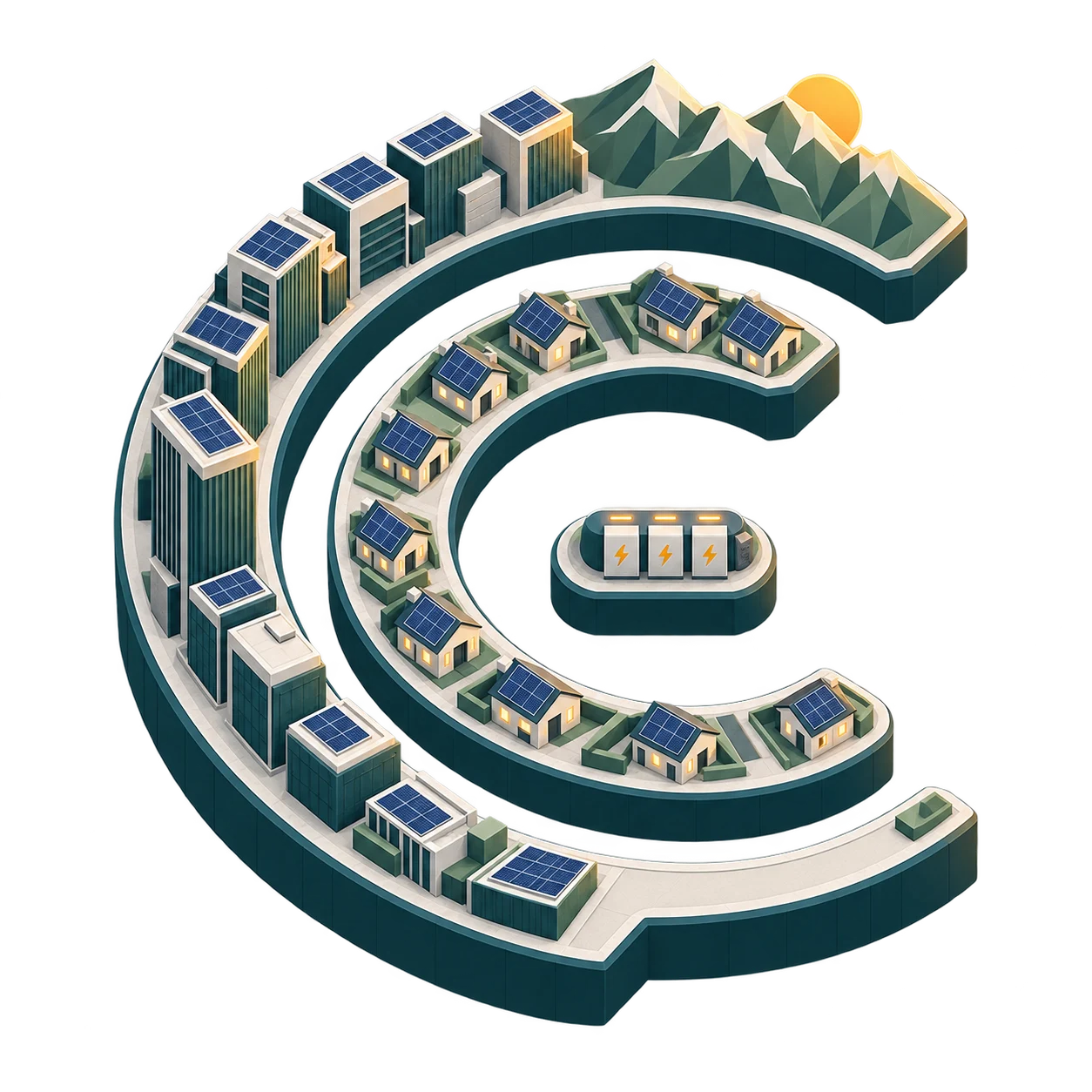
Early image-generation and 3D studies tested whether the CCE identity could become an energy landscape. They established an isometric direction, but were not a working website or a real installation. My direction: preserve the letter structure and test a controlled visual language. The final web scene became a simpler commercial property, rather than carrying every motif into the interface.
02 / Design decisions
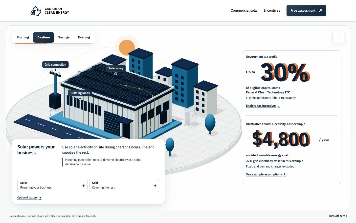
The interactive property connected roof generation, building use and the grid. Figures made the commercial opportunity visible, but this version put a lot of explanation into the same screen. My direction: make the numbers literal 3D assets, keep the model legible, and treat the battery as an optional addition. AI-assisted coding translated those constraints into the scene and controls.
03 / Design decisions
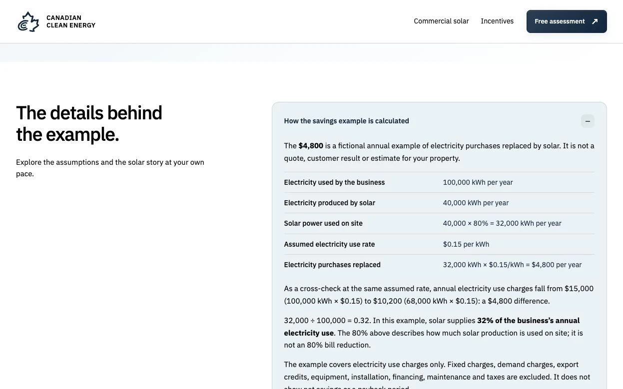
The tax-credit maximum and annual electricity example needed different labels and conditions. A large figure without a clear basis could suggest a guaranteed return. My direction: preserve the orange fronts, align each number with its explanation, and separate the credit from the fictional annual example. The supporting calculation stayed available below. The annual example uses 40,000 kWh × 80% on-site use × $0.15/kWh = $4,800/year, before system costs and other bill charges. It is not an actual customer result.
04 / Design decisions
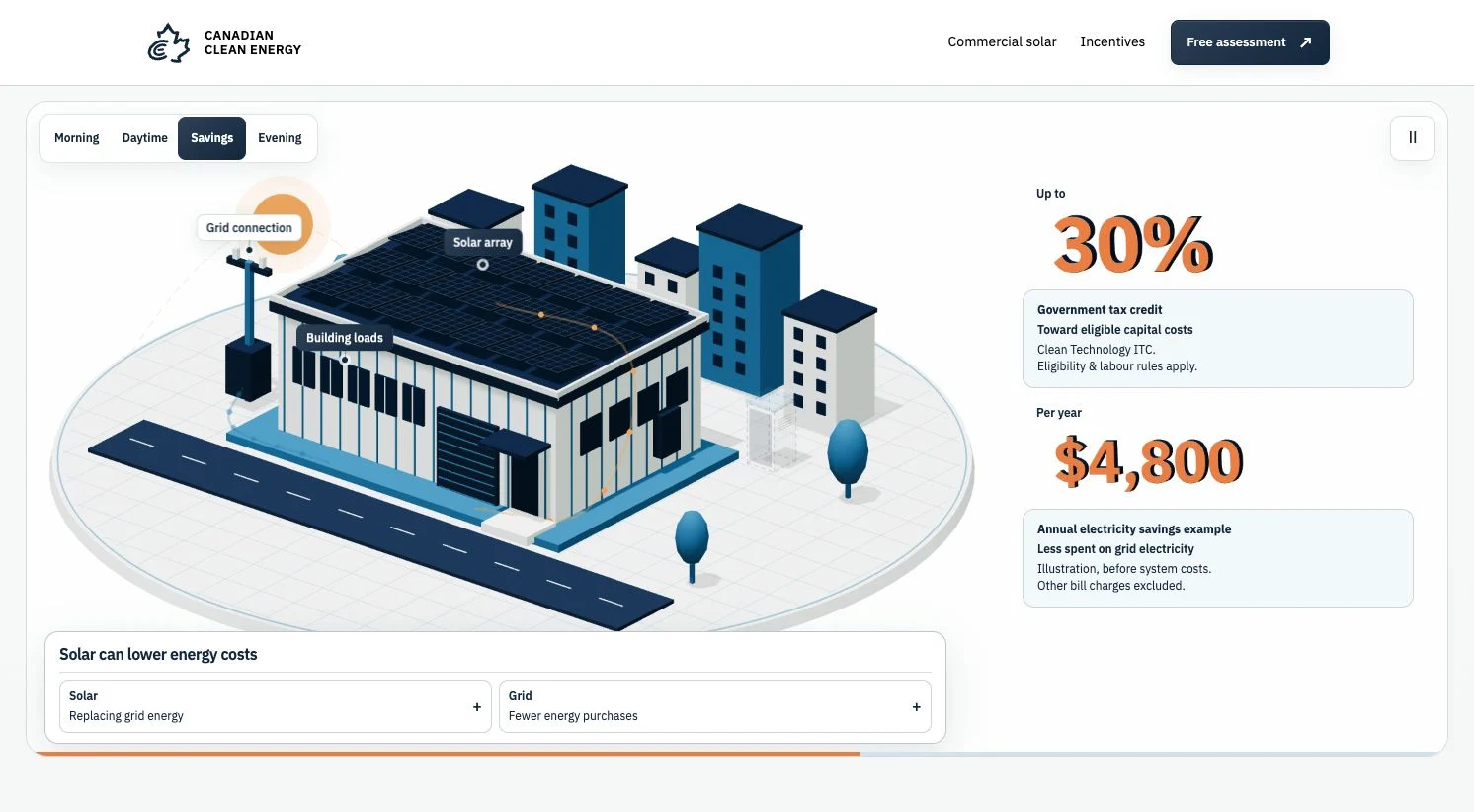
The owner wanted potential savings to be visible, but the page accumulated a second benefits recap after the model. My feedback questioned the added friction. We removed that repeated section, kept practical project guidance and made the calculations optional. The direct assessment link connects the scene to the original HighLevel form. The qualified credit maximum and fictional annual example remain separate claims.
05 / Design decisions
A later review exposed a real miss: the expanded savings panel still had text against its edge. Older CSS rules overrode the newer card styling. My direction: remove the conflicting rules and check every expandable panel. The record covers 21 panels, open and closed, at desktop, tablet and two phone widths. This was a layout check—not proof of conversion or lead delivery.
06 / Design decisions
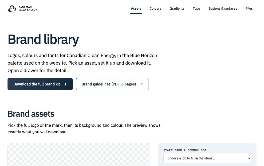
Editable source, original references, dated reviews, browser evidence, rollback archives and generated publishing output stayed separate. A brand library connected logo variants, colour tokens, typography, guidelines and downloadable assets. I used AI to help maintain the code and records while keeping original material and evidence boundaries visible.
What came out of it
A live commercial-first website with an interactive solar model, a documented brand system, responsive layouts, incentive guidance and the supplied hosted enquiry form. The live website and brand library were visibly captured on 20 October 2026; release records date the launch to 16 October. No sales or conversion improvement is claimed.
Close the remaining operational checks with the owner: email verification, provider-managed policy links and a controlled proof that an enquiry reaches the team. At the latest recorded handoff those were still open; this case does not represent a fresh private-account audit. Measure performance and visitor understanding before adding more motion.
Additional views and the assets discussed above. Open images for their full composition; videos use native playback controls.
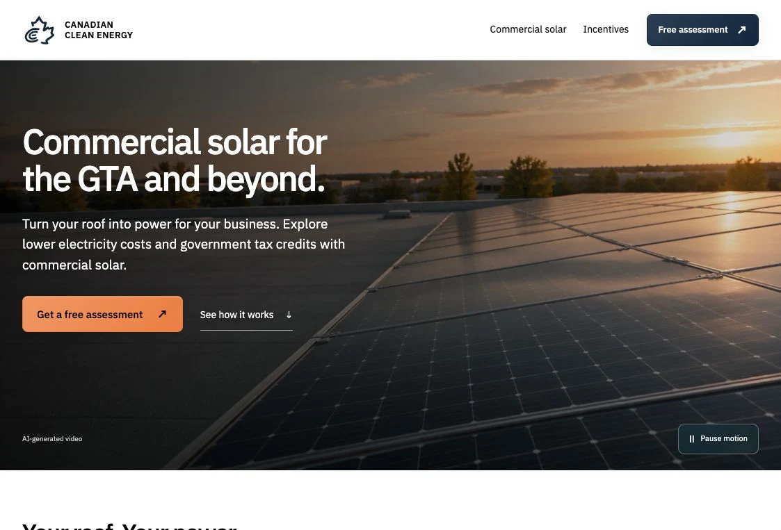
Commercial-first hierarchy, optional storage, the next-step flow and the balance between prominent numbers and inspectable explanations.
The coded model, 3D numeral geometry, chapter controls, progressive detail and responsive implementation.
Owner-supplied hosted enquiry form. Embedding is separate from verification of lead receipt.
Separate review and production delivery, with build records, domain handoff and rollback archives.
AI-assisted implementation, iteration, debugging and reproducible checks. Human review set the priorities and challenged weak results.
Supported by project conversation, source and review records.Early architectural-mark and solar-city visual studies. These are labelled generated concepts, not project photography. A complete saved prompt is included below.
Exact prompt and generated assets retained in the dated project archive.A separate early editable isometric study. The final live web animation was built in Three.js.
Dated model-study handoff; not attributed as the live runtime.Original direction · selected evidence
These original conversation excerpts retain their wording. The interpretation below each is edited case-study copy, not a transcript. They show how I steered AI-assisted work rather than accepting its first result.
The number look like low graphic also no animation for them
Alejandro · original project conversation
Design decision. Make depth and motion meaningful without losing legibility.
The scroll is a congested funnel to the form I feel so let’s ensure this is easy big number titles and delivery but also story telling and getting consturmers right I feel like we added friction and overload of information
Alejandro · original project conversation
Design decision. Remove the repeated benefits recap; retain practical guidance and optional calculations.
Make the number have the same colour as before tho with the orange front also add the scroll nav feature at bottom of window
Alejandro · original project conversation
Design decision. Keep the orange fronts and separate stage controls from the progress rail; later direction returned the stage buttons to the top.
Use case: stylized-concept. Asset type: Canadian Clean Energy architectural brand illustration for website and motion exploration. Edit the supplied flat CCE mark into a polished orthographic isometric 3D scene. Preserve the reference mark as the exact ground-plan silhouette: two concentric open C-shaped strokes, both openings on the right, and one short horizontal E stroke at the centre. The whole mark must still read clearly as C nested in C with an E tick when seen from above; no extra strokes, rings, letters, or power-button stem. Extrude different portions of those three stroke footprints into credible commercial buildings at varying elevations. Give the buildings pale architectural facades, deep petrol blue-green structure (#123B45), restrained sage (#6D927D) accents, and small warm amber (#E4A446) details. Integrate neat rooftop solar panel arrays on sun-facing flat roofs and a few compact battery-storage cabinets in the inner court. Show the construction with crisp isometric geometry, aligned grids, consistent extrusion direction and realistic rooftop details, suitable for a premium commercial solar company. Soft daylight and subtle diffuse shadows. Isolated transparent background, no skyline, no text, no labels, no watermark. The logo geometry is more important than generic city scenery.
Earlier architectural-mark study · 24 September 2026. The generated concept shown above is a later iteration. The prompt documents requested constraints, not proof of exact geometric fidelity.
Source basis: selected conversation excerpts and dated project records. This is not a full chat export. Original screenshots were resized and encoded for the web without generative changes.
Let's talk. I'm open to junior experiential, exhibition, spatial, service and product design roles — Toronto-area hybrid, remote, or contract.